Introduction
Approaching the end of my CareerFoundry course journey, the last few months I have been focused on User Interface Design. Out of four potential projects, I selected one that I could relate with most, myTone. My personal investment in health and fitness the past 22 years seemed like the perfect fit to create an application that would meet the needs of individuals interested in enhancing their lifestyle through health and fitness.
Understanding
the Challenge
Many careers today leave little time for someone to invest into their health. Long hours and commutes make it difficult to find time to fit a workout in. Sedentary jobs only make this situation worse. After a long day at work, a person is ready to relax or may have just enough time to prep for the next work day before having to go to bed. Or some in cases, a person might have time at work to fit a quick routine in between meetings, but do not know what to do.
Trying to balance health, work and personal life can be a challenge. With an application designed to help manage free time, individuals will find exercising regularly to promote better moods, weight management, and reduce risks of illness easier.
User Stories
As a new user, I want to be shown how the exercises are done, so that I know I’m doing them correctly.
As a frequent user, I want to be able to schedule exercises for working out, so that I build positive habits.
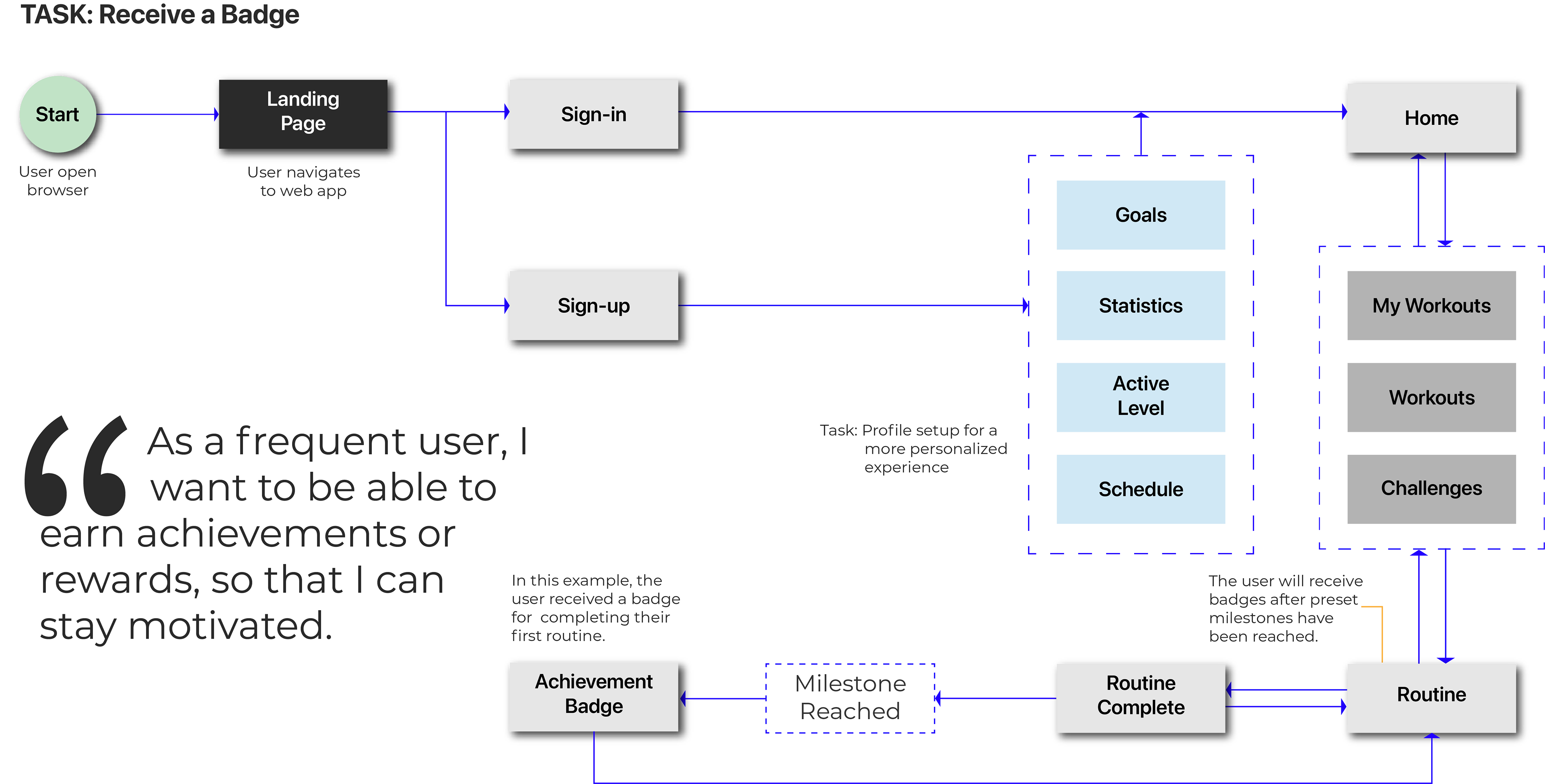
As a frequent user, I want to complete daily challenges, so that I can have an additional way to stay motivated.
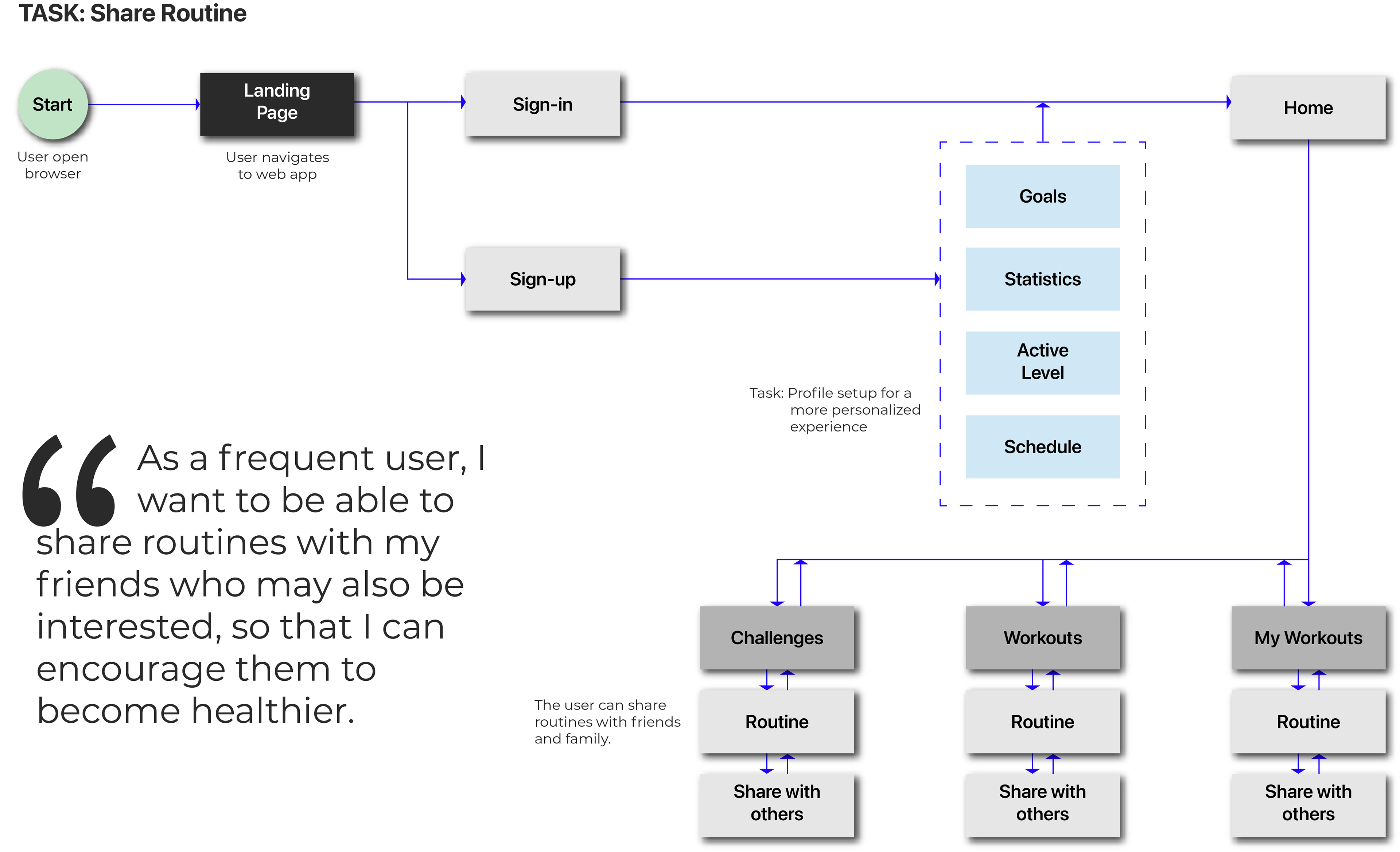
As a frequent user, I want to be able to share routines with my friends who may also be interested, so that I can encourage them to become healthier.
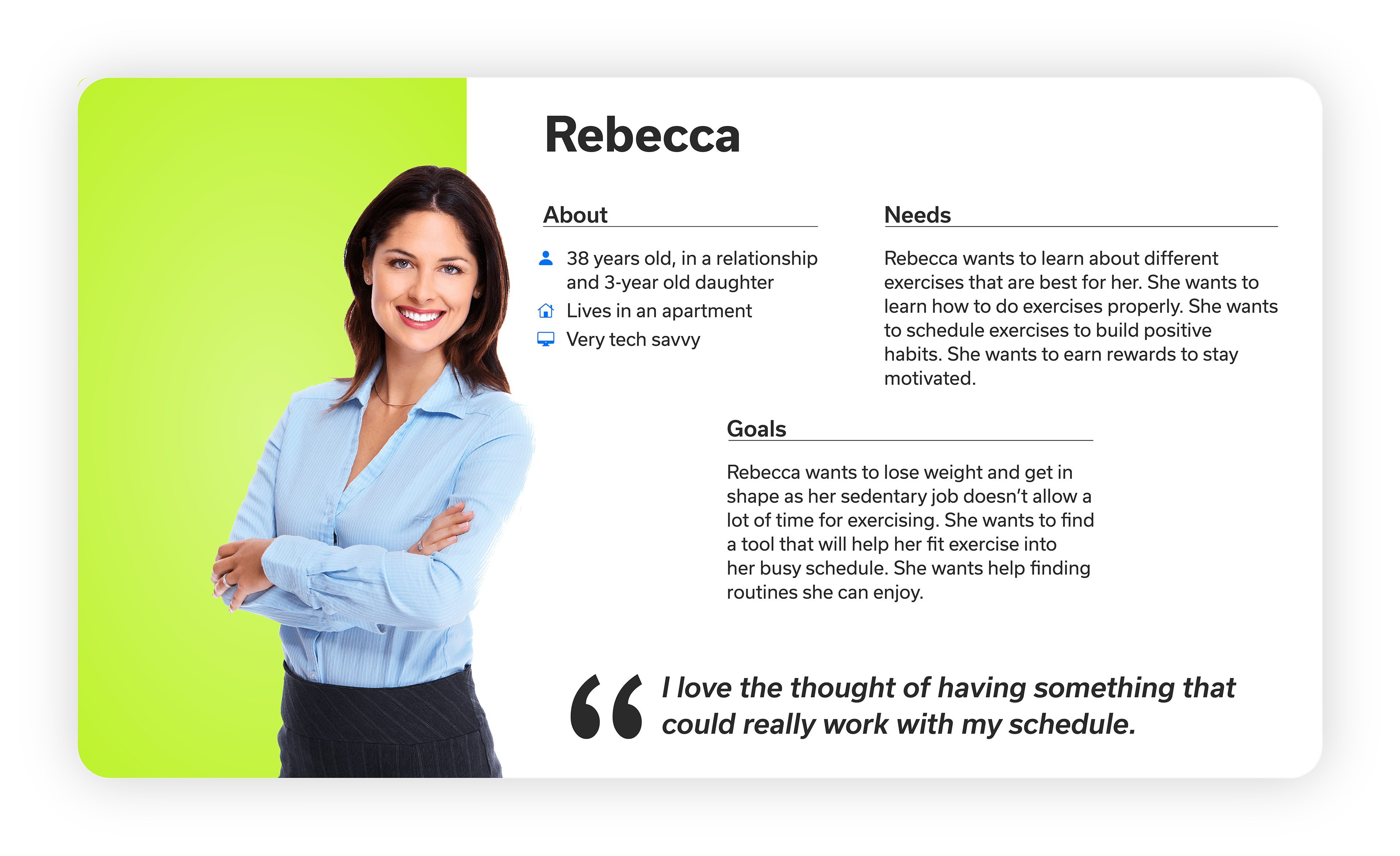
Persona
Focusing on a single persona, it was easy to keep the user’s needs in mind.
I was able to make effective design decisions, coming up with great ideas and features.
User Flow Charts
At this point, I only had a basic idea of how the web app would function.
Mapping out the flow of the web app helped me sort out the different path’s users will take to complete any given task.

Initial Sketches
This step allowed me to visually imagine the layout of the web app.
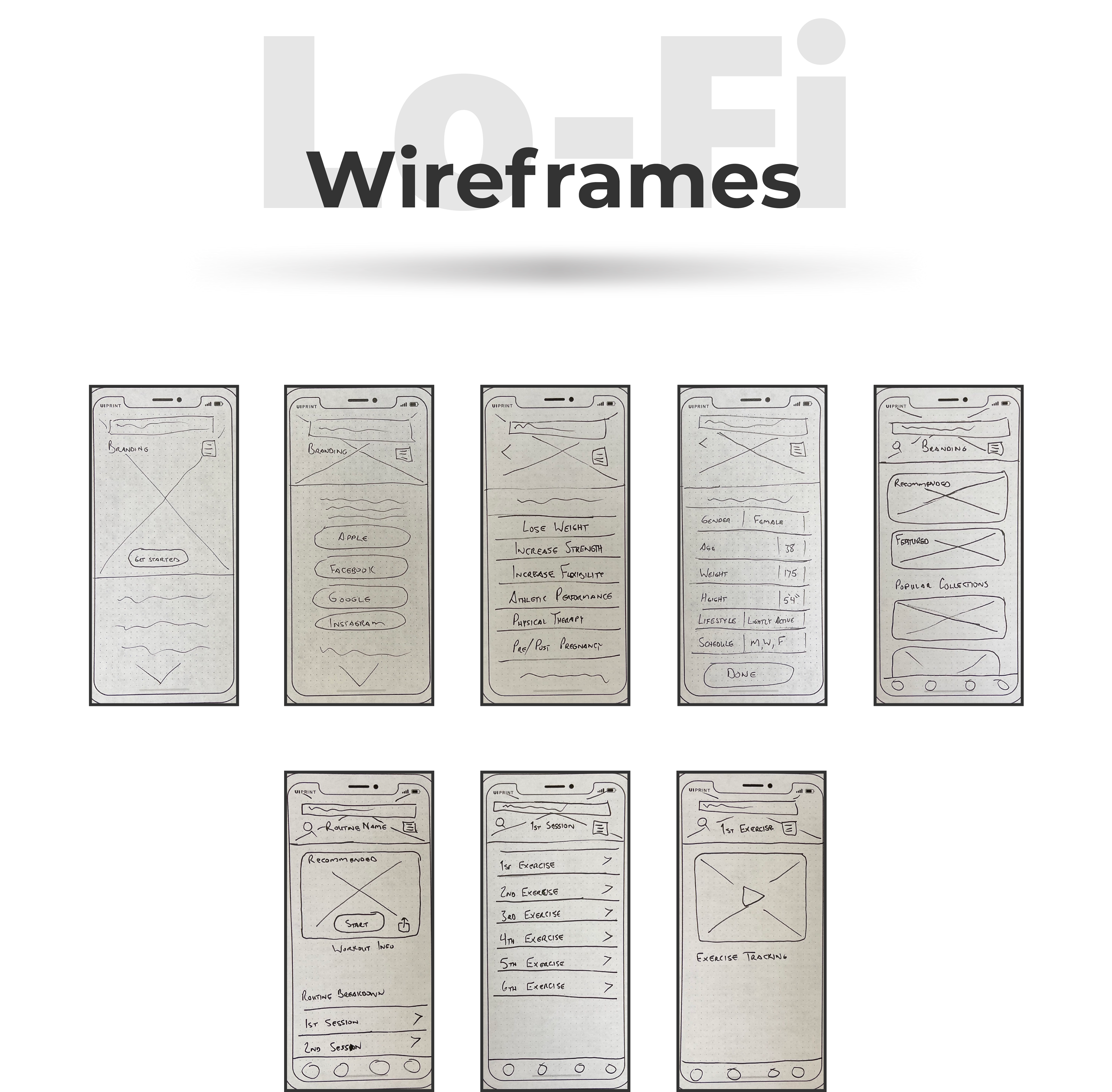
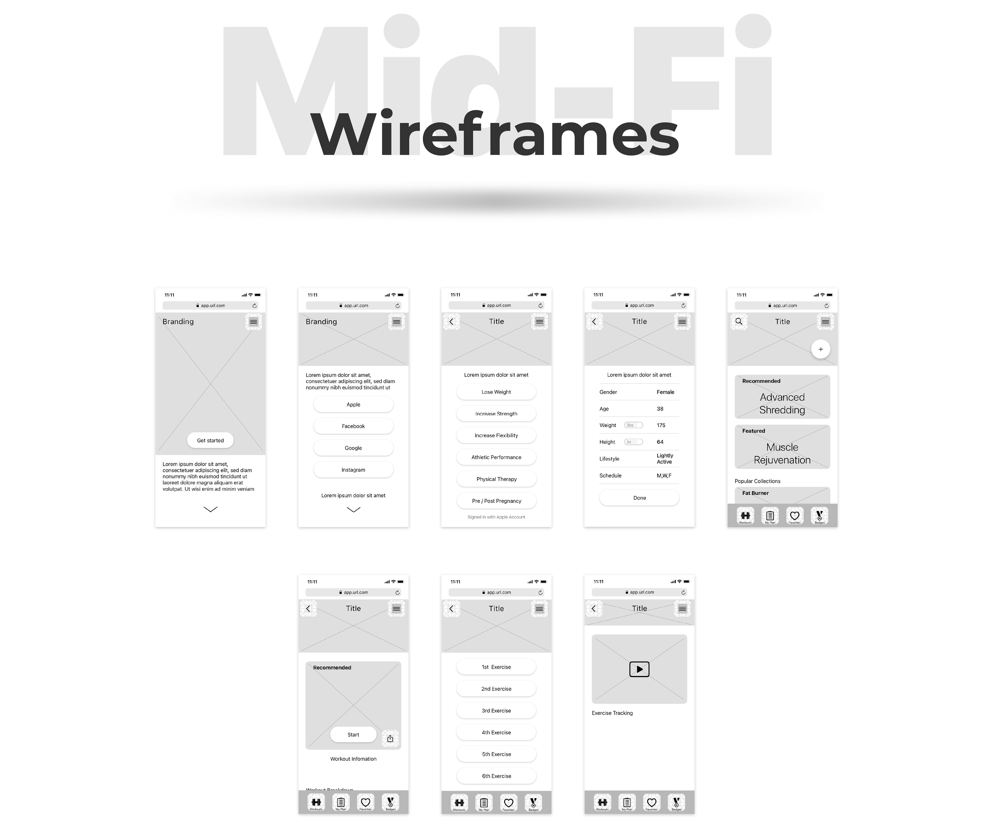
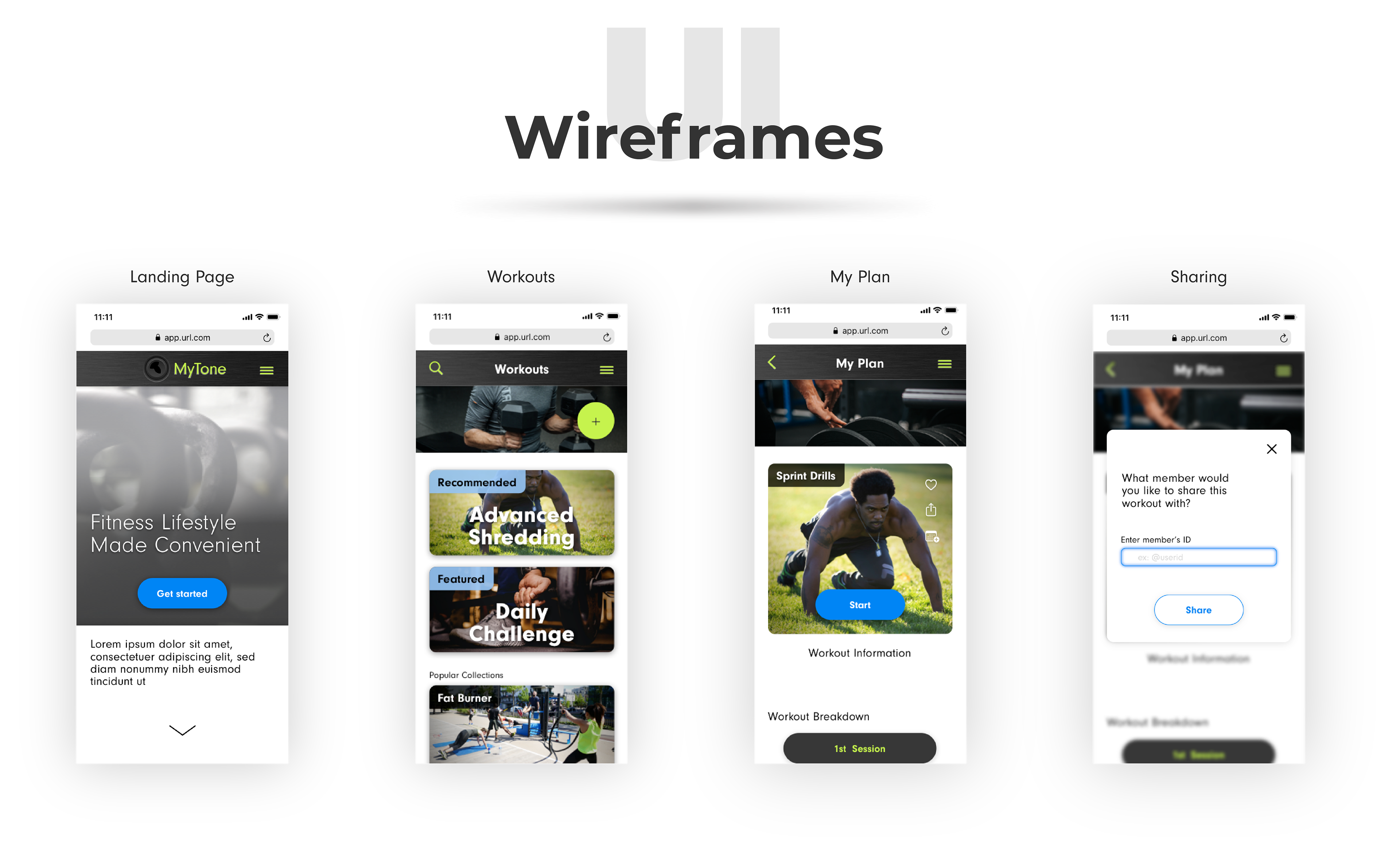
Wireframes
In this step of designing, I was able to see the framework and arrange the elements with primary focus on functionality rather than cosmetics.
This also permitted testing out ideas before too much time was invested.
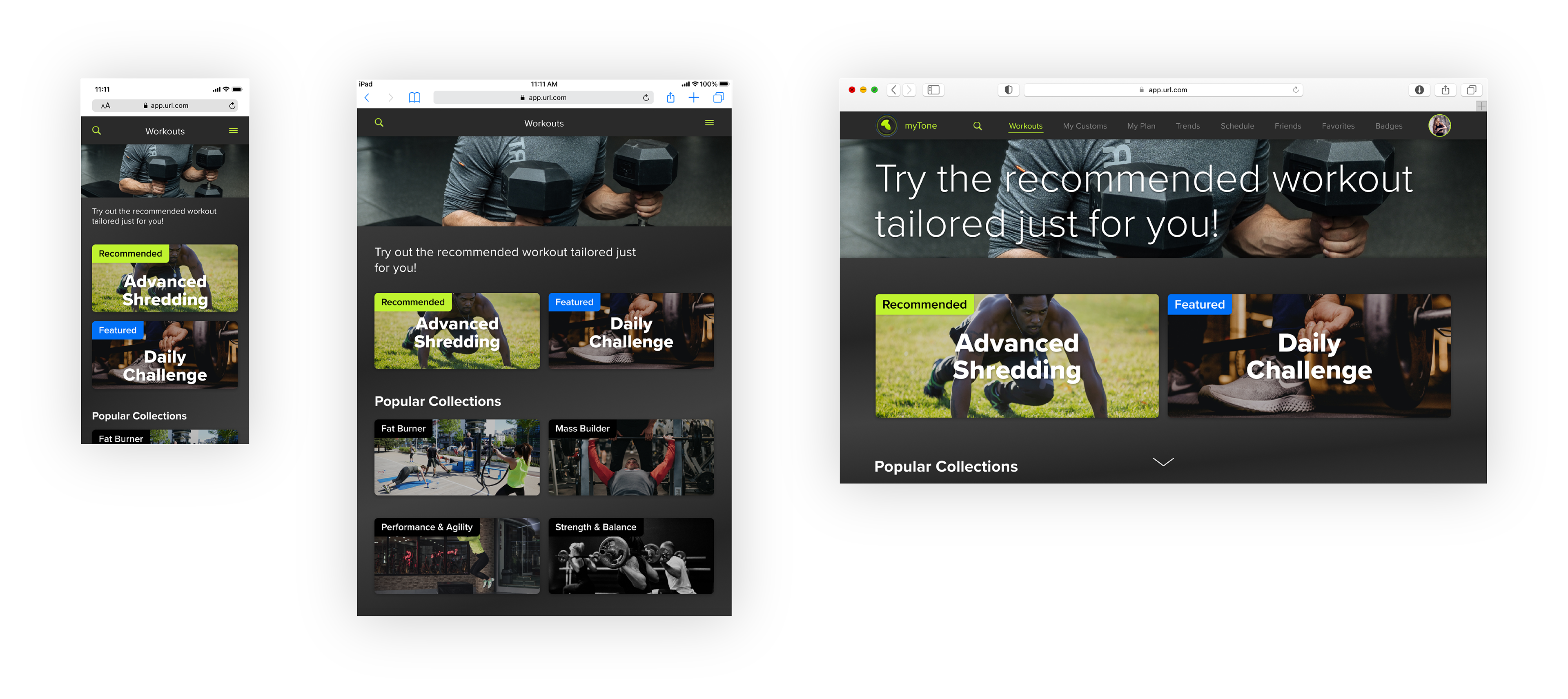
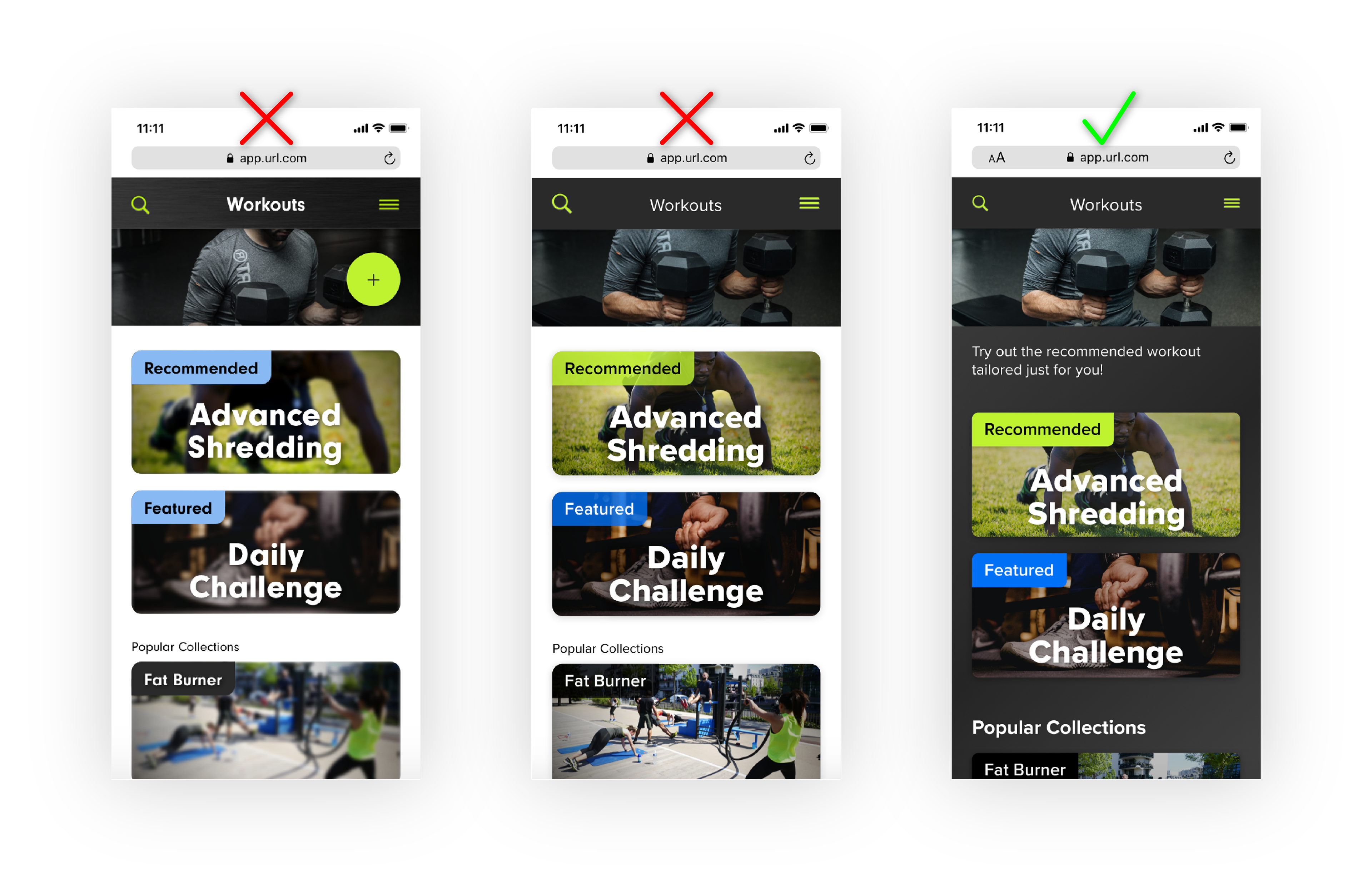
Responsive Design
myTone web app was designed for three break points: mobile, tablet, and desktop.
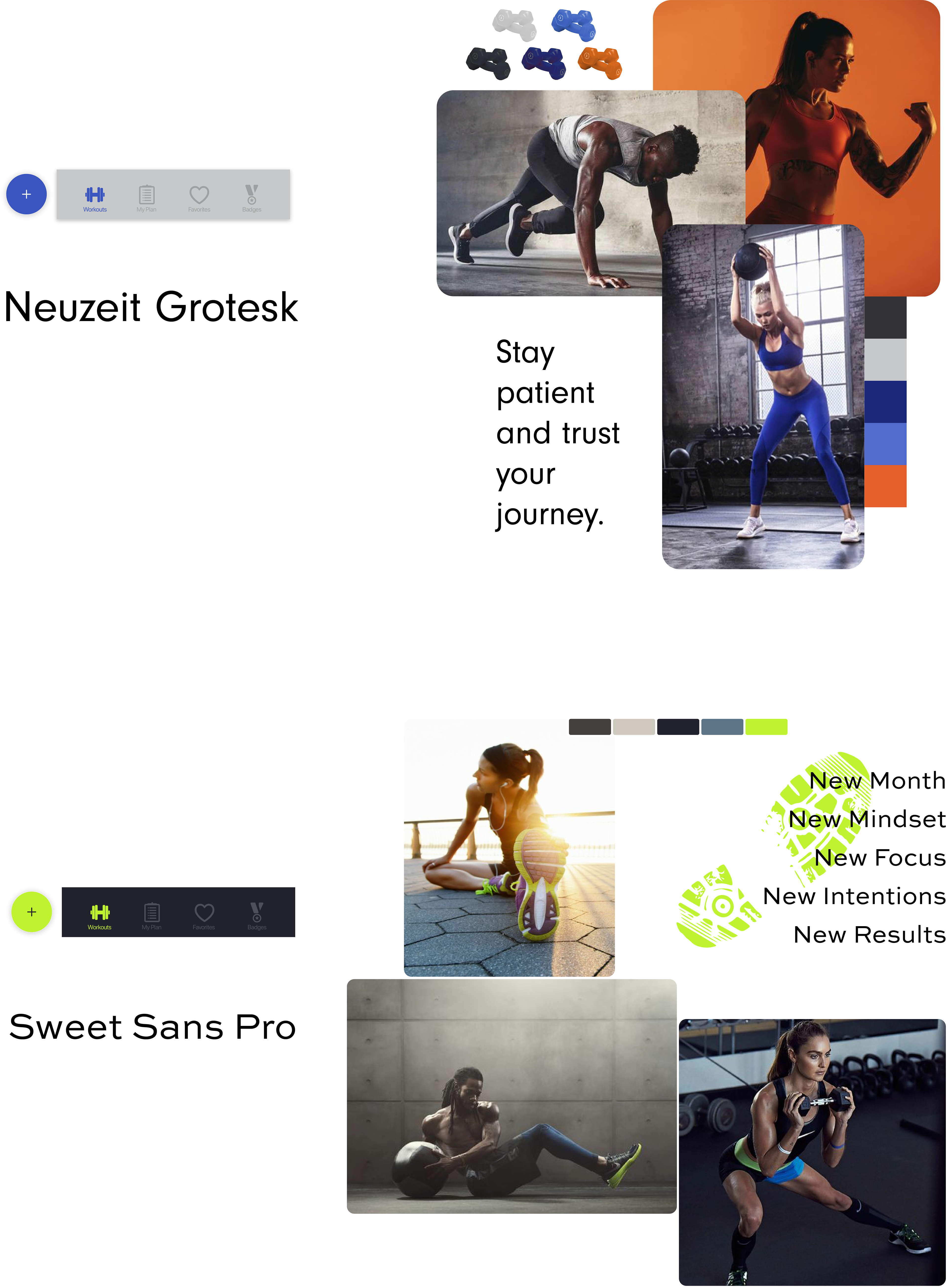
Mood Boards
Before diving into the visual design, I put together a couple mood boards. This helped me learn what inspirational collaborations would be suitable for this web app, triggering an emotion a user would find appropriate and engaging.
Even after creating these mood boards, still I was not satisfied and ended up mixing elements from both to create a new theme.
Iteration
Next, with each iteration, I was able to see what worked and what didn’t.
Style Guide
For the color selection, I chose a shade of green, blue and gray. With color theory in mind to evoke specific emotions, the colors chosen made the most sense to me.
Two emotions of the color green that seemed fitting are growth and harmony.
The color blue communicates trust with an inviting atmosphere.
Though not black, the shade of gray chosen is very dark, making the design trendy, modern and sophisticated.
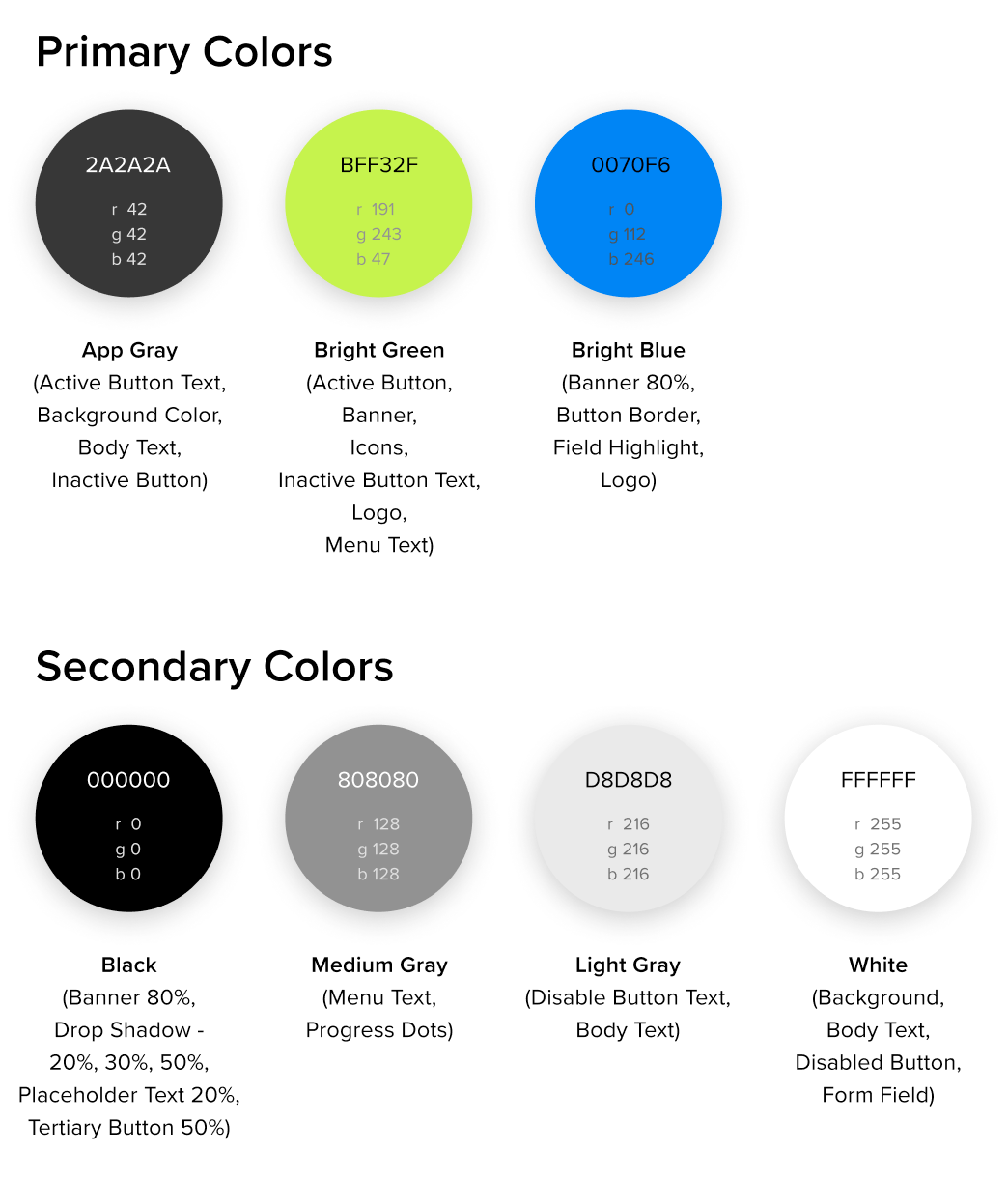
The font chosen for myTone was Proxima Nova. This is a clean looking Sans Serif font family that was simple and complemented the interface.

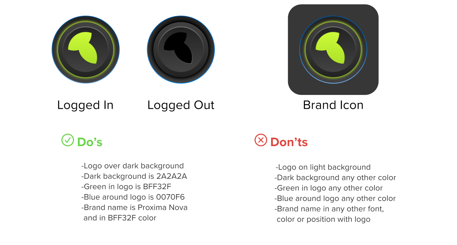
Thoughts behind the logo were derived from the user persona. She is a person who is in the tech industry as a Software Developer, being very tech savvy.
So, I designed a logo that had a tech feel while keeping the web app intuitive.
Final Design
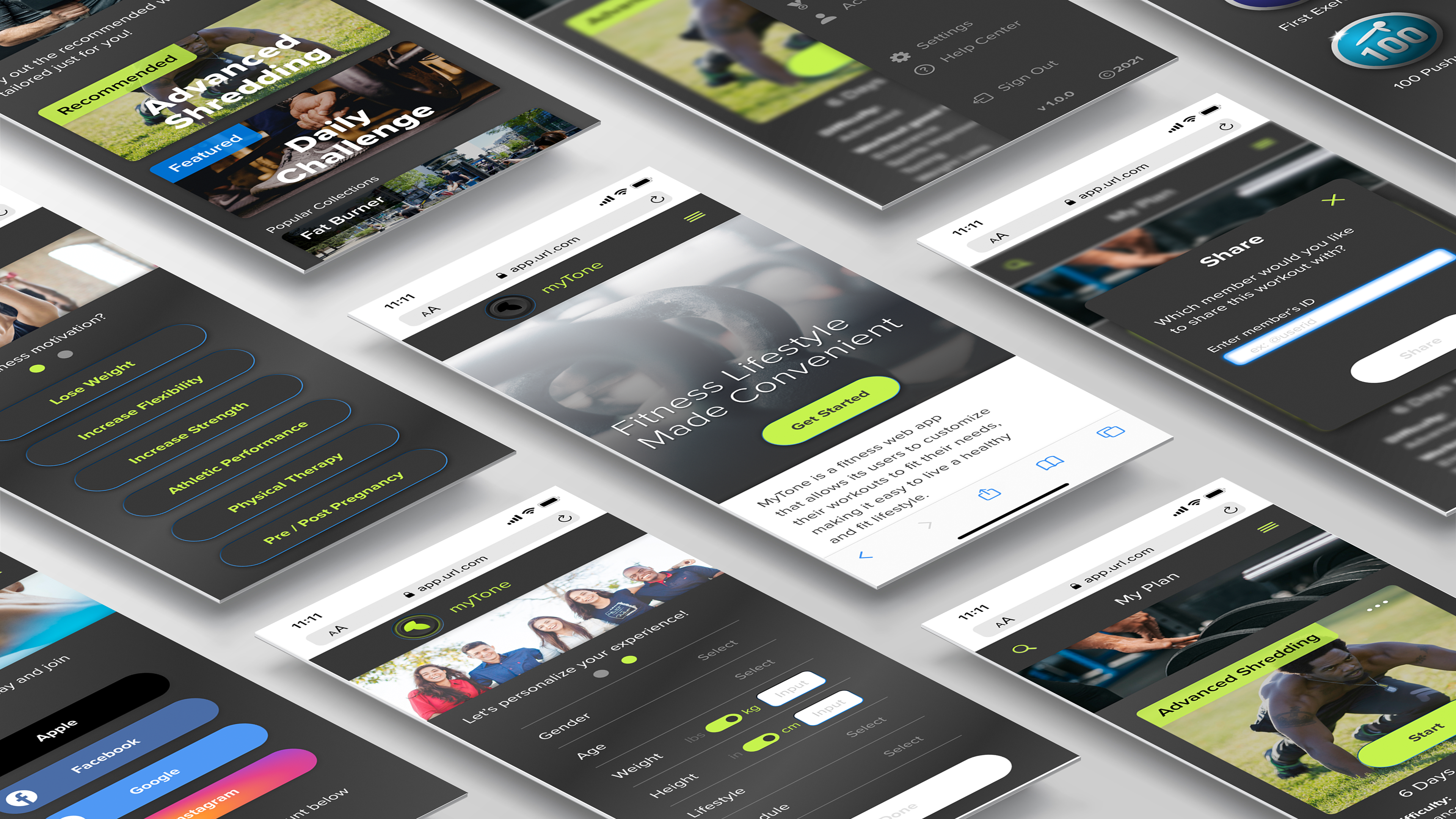
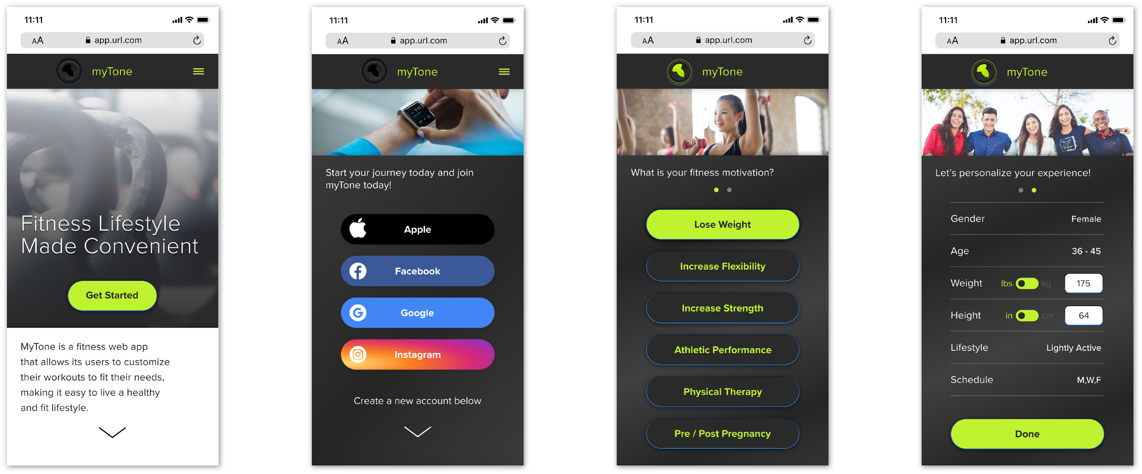
Onboarding Flow
The onboarding goal for myTone is to gather enough information about the user to make the experience personalized while offering workouts and other content directly related to the user's needs. The onboarding process has been simplified, keeping the user engaged without being overwhelmed.
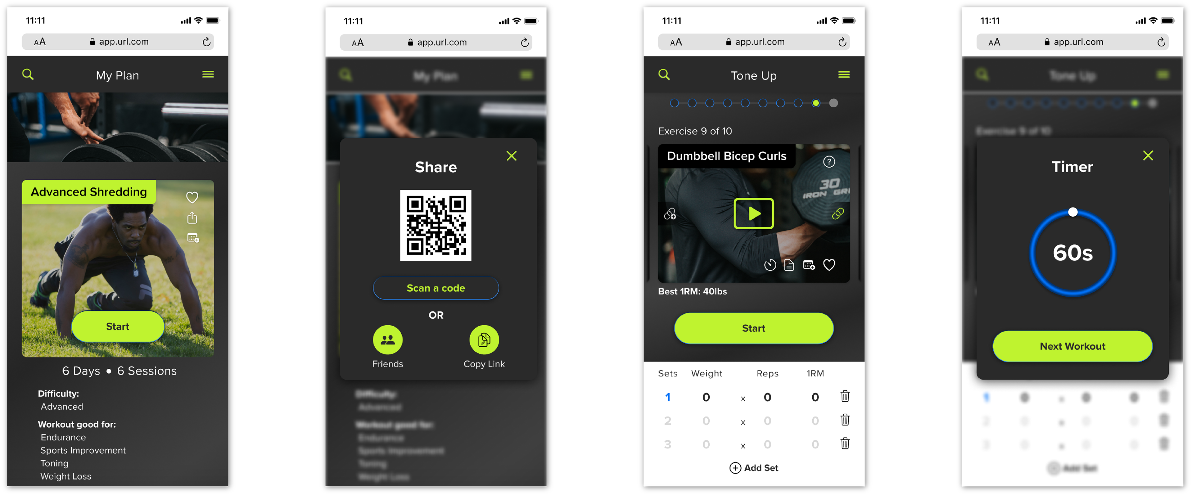
My Plan Flow
Post onboarding, the user is presented with a range of workout routines. Ranging from a Recommended personalized plan, to Daily Challenges, to different exercise goals, all within the user’s experience level, time constraints and equipment availability.
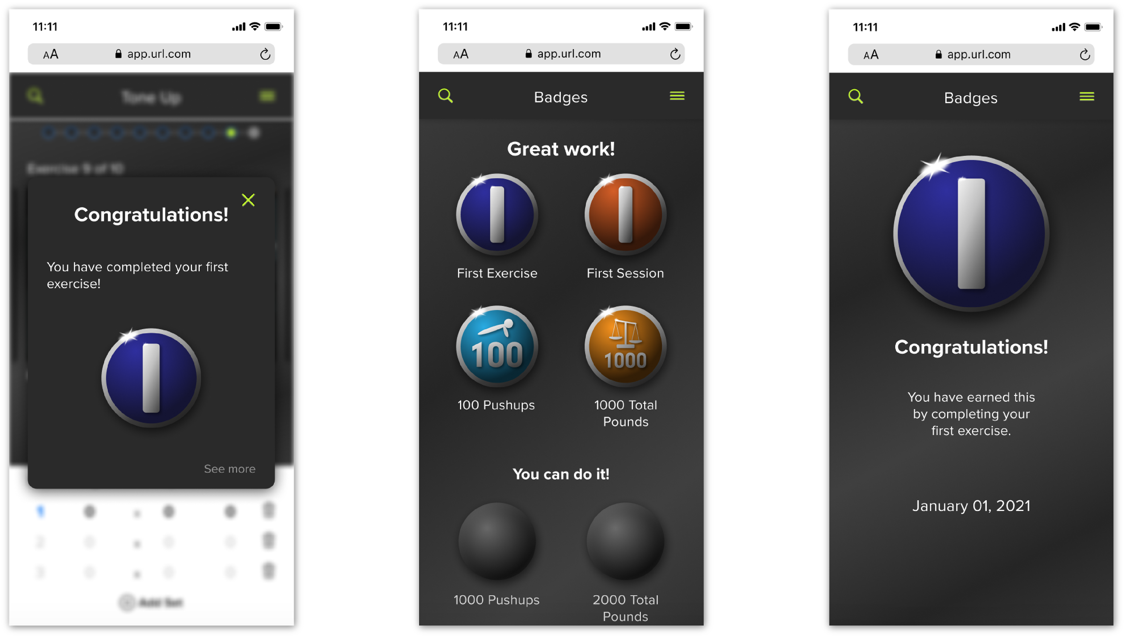
Achievements
To keep the user’s drive and ambition high, I have added a feature that allows the user to achieve specific badges for specific milestones. These badges accumulate in a badge archive, giving the user the option to revisit what they have achieved over time.
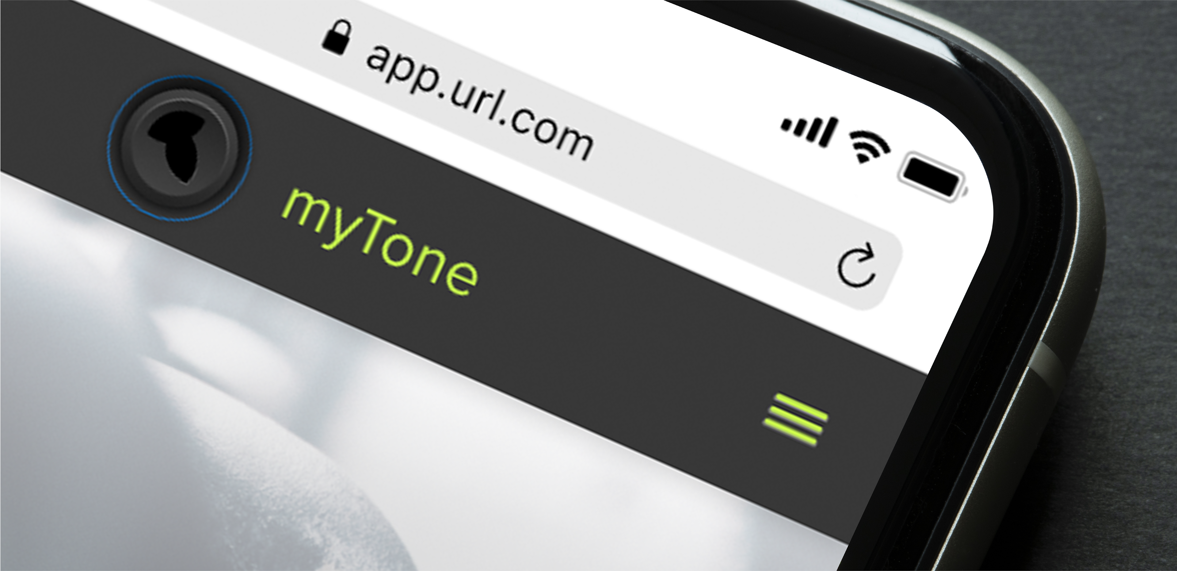
Prototype
(Click the image below)
Conclusion
What did I learn?
The journey of designing myTone has been both gratifying and challenging. I used both my personal experience and the user persona to get a deeper understanding of what users face when trying to fit exercise into daily routines. Designing something that was not a hinderance to a user while making sure it delivered what the user needed to get back into shape was the biggest obstacle.
After researching many other fitness apps, I was filled with enough insight to get a full understanding of what the user’s needs were. Through this entire Design Thinking Process, I was able to come up with a design that was engaging for the user, both visually and the experience within.
What are the next steps?
-Further research for improving and adding features
-Usability testing with live users
-Research for improving flow
-Research for improving UI to keep a fresh look and experience